Workplace
Jun. 7, 2021
The “Next Exit” takes an iconic brand into the future
[McDonald’s] Chicago, USA
Upon exiting the elevators on each floor, visitors are greeted with “brand moments”—design installations that communicate company stories, and point toward where the brand is headed. Many riff on the company logo or colors, like the entryway that features an M-shaped arch.
“These moments or art installations evoke specific elements of history and brand— the kitchen, the flavors, the people, and the communities throughout the world where McDonald’s operates,” Creative Design Lead Juliana Strieff says. “We wanted to highlight special moments that are unique to our space to create a one-of-a- kind experience for our employees and all who visit with us.”
In June 2018, the U.S. McDonald’s headquarters moved from Oak Brook, Illinois, to the center of Chicago. The new building houses both U.S. and global business departments, as well as Hamburger University, McDonald’s training facility. Formerly, all three were located in separate buildings, half a mile apart.
The move happened for several reasons. For one, the mile-long round trip for meetings was inefficient, and for another, McDonald’s felt it was important to be a part of the vitality of the city. During the 1970s and 1980s, U.S. cities rapidly lost population to the suburbs, but the current ongoing influx of young people returning to cities makes Chicago the best place to find promising talent.
And the new office faces Randolph Street, a high- profile area flush with acclaimed restaurants. For McDonald’s, that considers itself as a restaurant company, “(Being on Randolph Street) is very significant,” Strieff enthuses.
McDonald’s wants to be a good neighbor to the local community. Though the initial plan was to make the McDonald’s restaurant exclusive to employees, it was placed on the ground floor so it could be open to the public as a way to engage with the neighborhood. And there are changes to how employees approach their jobs. Old customs and rules have been replaced with a more playful and relaxed working style, like the shift to activity-based working.
“Simply put, we wanted everyone to feel empowered to work in an environment that bests supports whatever it is they’re doing on a particular day,” Strieff explains. O+A’s participation suggests another reason the headquarters was moved.
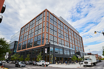
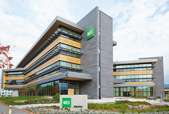
An exterior view of the new offices. Headquartered on Randolph Street, also known as “Restaurant Row,” the area has notably flourished since renowned chef Stephanie Izard opened her restaurant “Girl & the Goat” here.
-
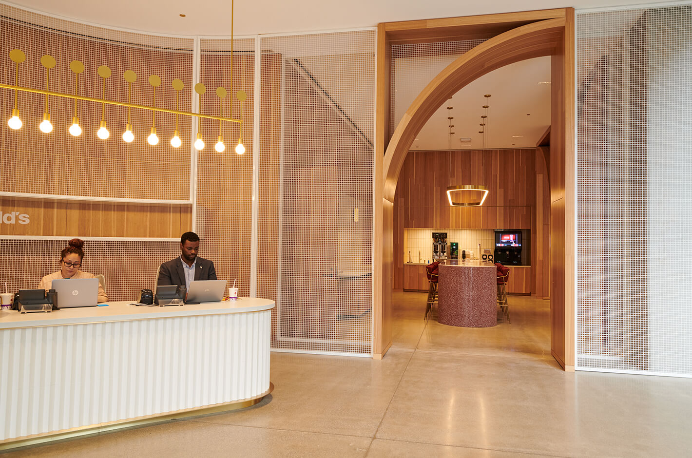
The entryway to the kitchen next to reception features an M-shaped arch. The mesh walls are inspired by the baskets used to cook the fries— some of the many brand moments incorporated on every floor.
-
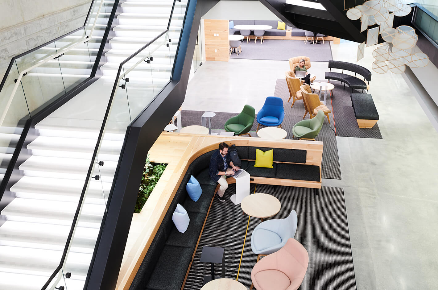
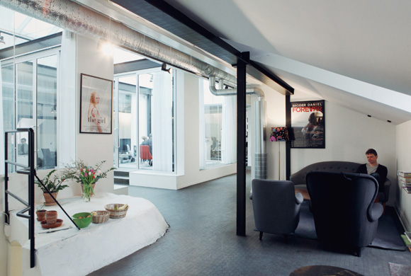
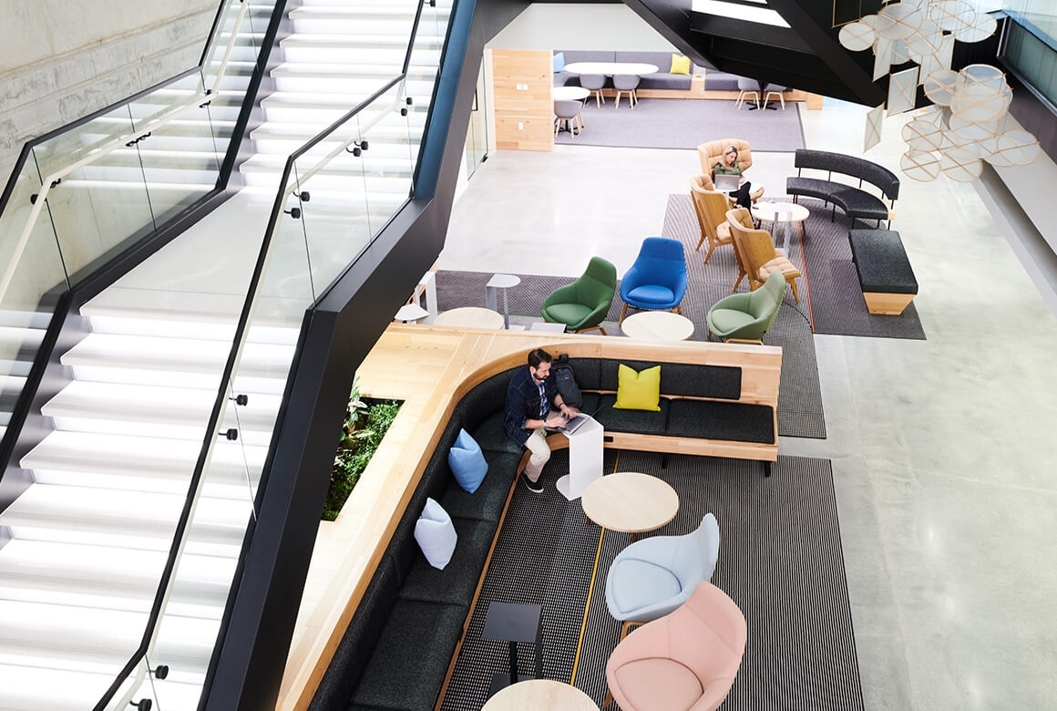
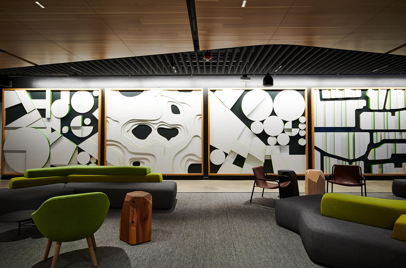
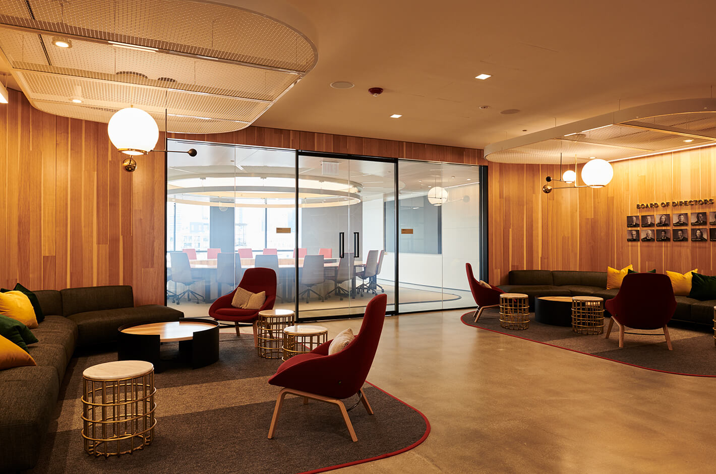
A lounge area near the internal staircase that runs through the office. The architecture was designed by Gensler, the workspace by IA (Interior Architects), and O+A was tasked with the concept phase and communal spaces, including this lounge.
-
The “Farm Wall” is another brand moment featuring a bird’s-eye view of agricultural areas like wheat fields, corn fields, and coffee farms, inspired by the places that produce McDonald’s ingredients.
-
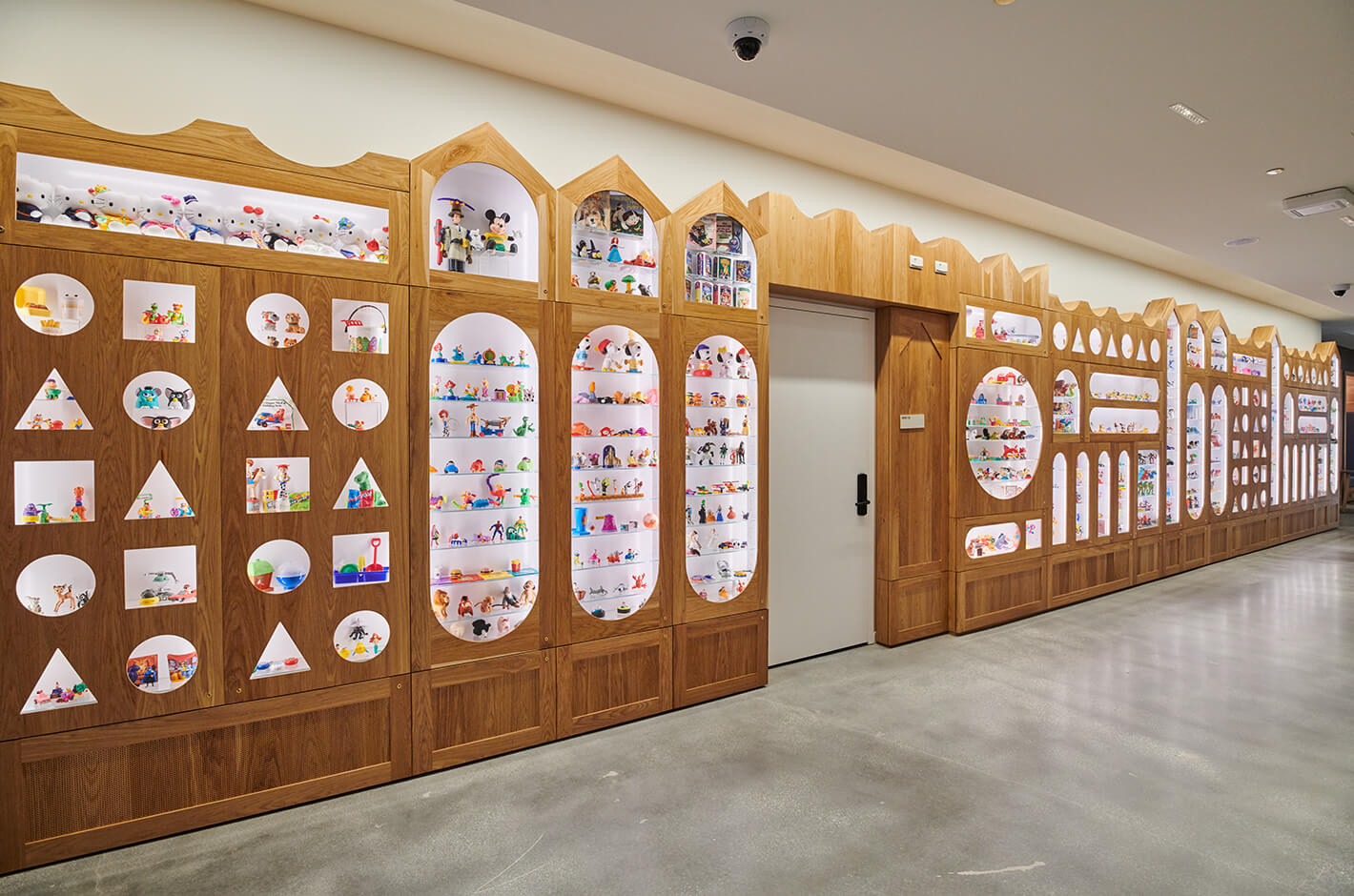
An archive of the toys from Happy Meals, with shelves inspired by building blocks.
-
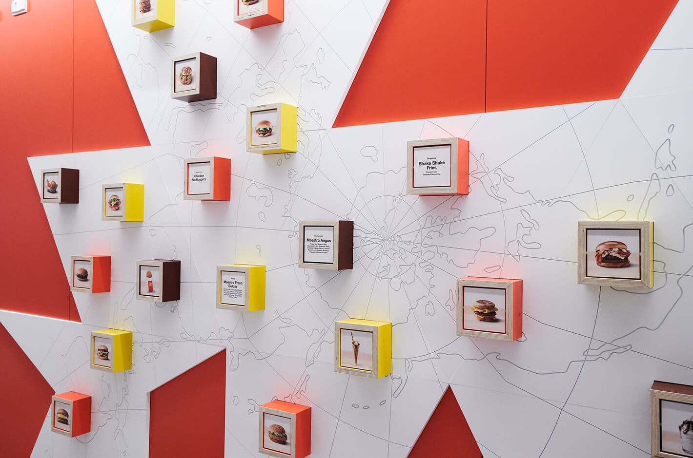
A display of the different menu items available locally around the world. Some items are available at the flagship restaurant on the ground floor, but are so popular they often sell out. These brand moments are featured throughout the building.
-
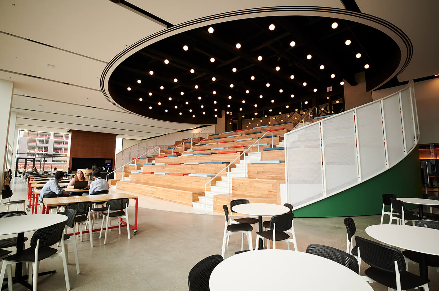
“Work Cafe,” a multipurpose space that functions as a cafeteria and meeting place, and is used for all-hands meetings. The massive oval ceiling is inspired by “PlayPlaces,” the McDonald’s play area for children.
-
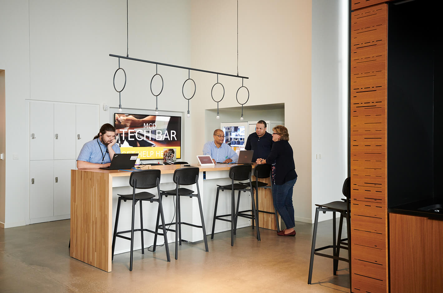
The “Tech Bar” in a corner of the Work Cafe, an in-house help-desk that employees can visit with IT-related questions. Placing IT help in the cafeteria makes access easy, reducing the stress of wait times, and gives opportunity to bump into colleagues. Vending machines that dispense batteries and mouses are also on-hand.
-
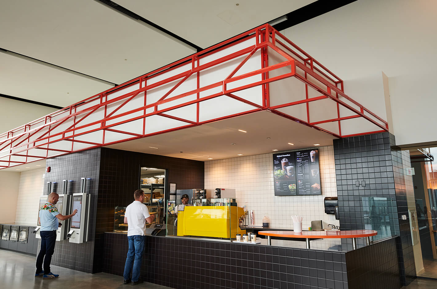
The in-house McCafe offers free beverages such as espressos and Americanos.
The classic brick buildings that hosted the former headquarters couldn’t accommodate the brand’s plan to modernize. As the world’s largest restaurant business, the company has revamped its standards for food safety to influence how society as a whole consumes. In April 2019, McDonald’s USA announced that it was 33% of the way to meeting their commitment to only use cage-free eggs by 2025 in their iconic breakfast offerings such as the Egg McMuffin.
A big undertaking, but an essential move to signal an industry shift in the right direction. As Strieff points out, “It’s one of the many ways we’re using our scale for good and make positive, meaningful changes around the world.”
The modernization of McDonald’s —this is the shift that the new headquarters symbolizes. Gensler, IA, and O+A collaborated on the construction of the new offices, with Gensler designing the architecture, and IA and O+A in charge of the workplace design. O+A was called upon to give life to the brand’s ideas. “We wanted to amplify the McDonald’s brand, our history and our heritage in a modern way,” Strieff says.
The common space, a portion of the furniture design, and the overall concept—“Next Exit,” inspired by a McDonald’s iconic drive-through— was done by O+A. “Referencing our place in car culture history, and a bit of a play on the classic road trip, it reflects our spirit of willingness to take ‘another exit’ to new menu items or customer experiences,” according to Strieff.
O+A’s office plan reinterprets McDonald’s’ identity as a brand, and projects it onto a space. Although the office speaks to the past, present, and future of McDonald’s, the red and yellow brand colors, or even Ronald McDonald, are nowhere to be found. “We wanted to create a space that celebrates our history and how far we’ve come, but more importantly, where we are going,” Strieff reflects. “O+A had a very specific interpretation of who we are as a Brand, and our place in the industry as an innovator.” Strieff is happy with the result.
-
A board room designed to be calm and friendly. Rather than an overly luxe office, McDonald’s wanted a modern feel that still imparted a sense of tradition.
-
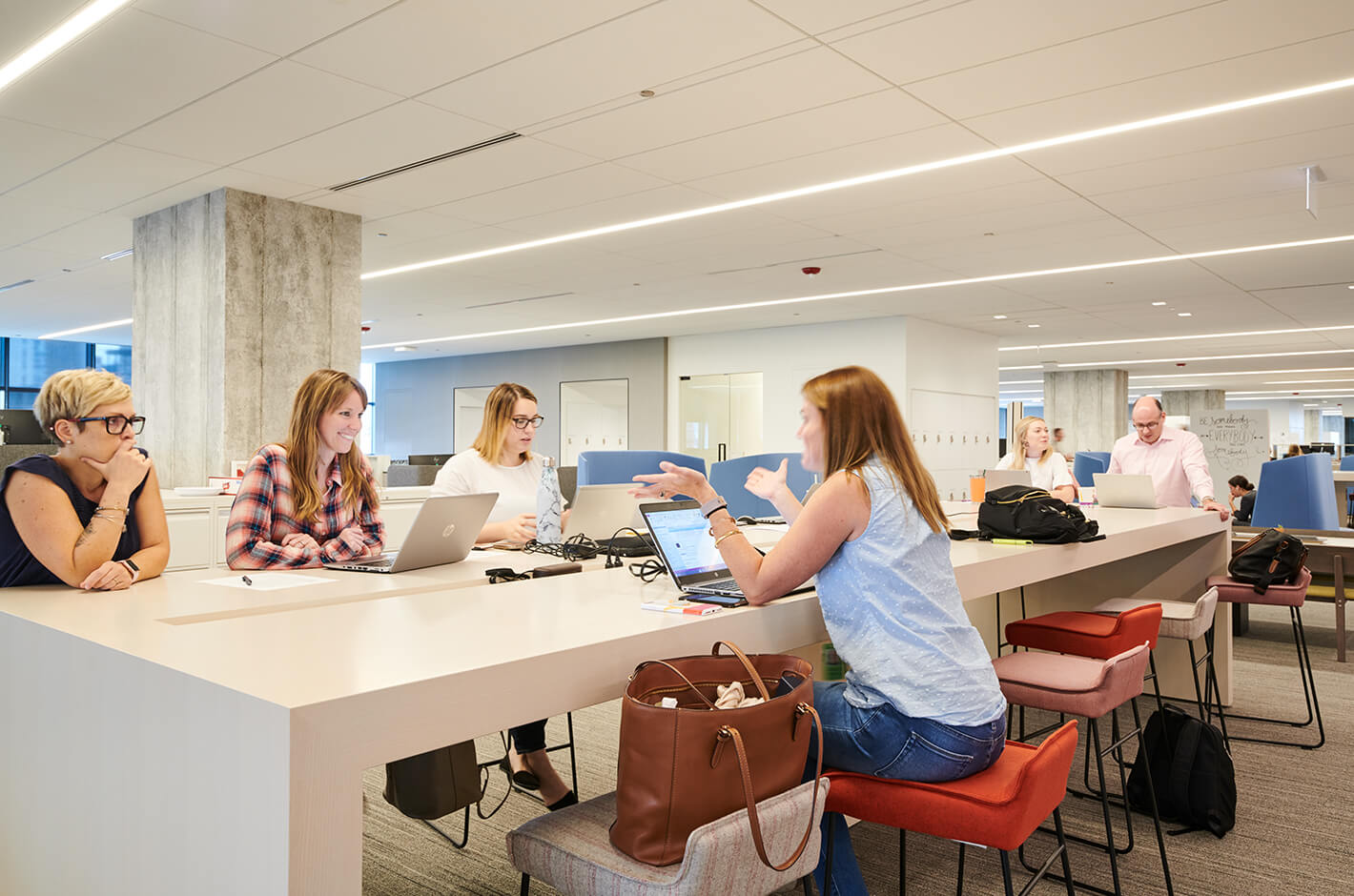
An open work space. The former office featured cubicles that hid employees from view, while the new office has only five private offices.
-
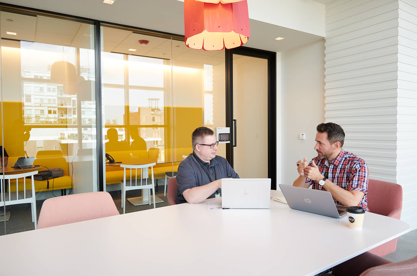
A variety of open meeting areas are available outside the conference rooms for ad hoc use. The former office had a suit-and-tie dress code, but the updated HQ style is more casual.
-
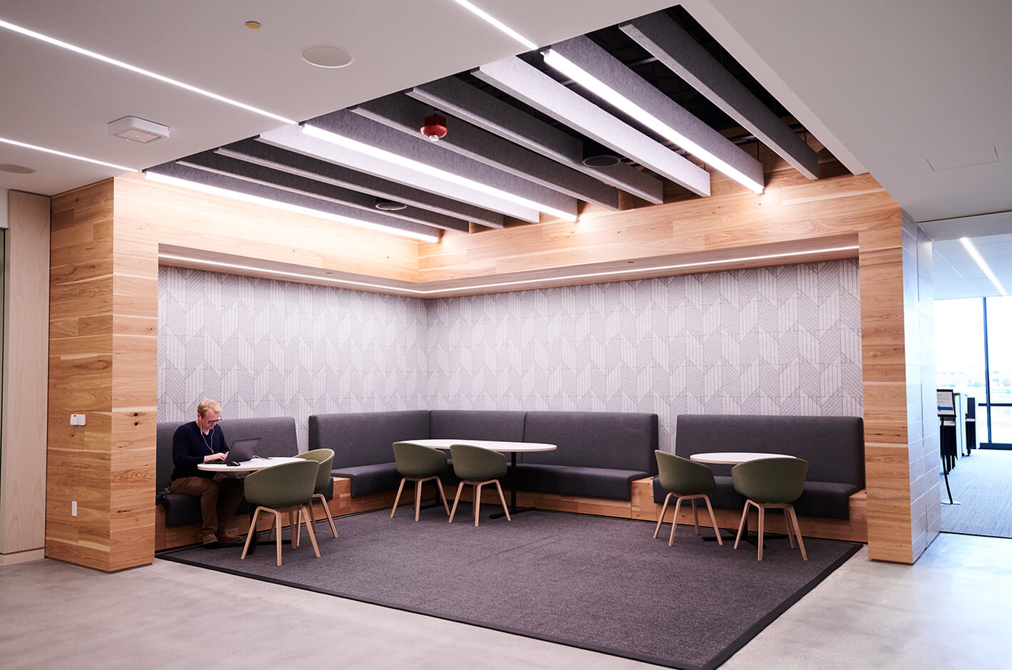
A lounge area. Activity-based working (ABW) is the norm at the new office. The design offers multiple types of workspaces so workers can mix and match where they want to work.
-
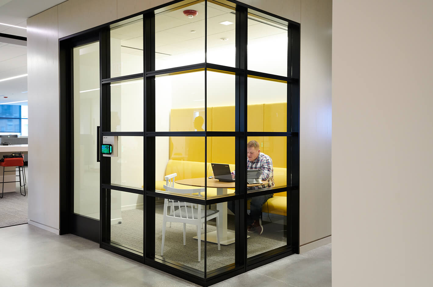
Multipurpose small spaces are installed along the hallways, and can be used for conference calls, smaller meetings, or work sessions.
-
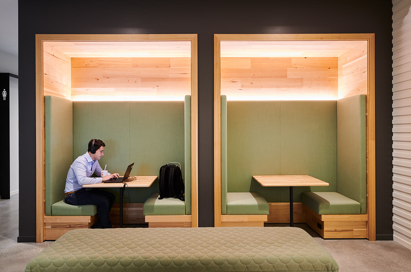
A “focus room.” Insulated from office noise, the room can be used by employees who prefer a quiet space to concentrate.
Hamburger University:
The training ground for the next generation of employees
Essentially the heart of the McDonald’s brand, Hamburger University is a place for trainees tonot only learn about what it takes to operate a McDonald’s restaurant, but also to become familiar with the brand’s culture, including its history and values. Like the headquarters, Hamburger University is stocked with design elements, also designed by O+A, that communicate the past, present, and future of the brand.
While McDonald’s restaurantsare located in over 100 countries,there are only seven Hamburger Universities worldwide, including one in Tokyo, with many of its graduates 1 going on to work at the headquarters.
“Every year, more than 3,000 McDonald’s crew members experi- ence four days of hands on training at Hamburger University to learn management and leadership skills,” Strieff observes. The curriculum at HamburgerUniversity covers everything from the ins and outs of menu items or how to use the kitchen, to management, leadership, and teambuilding. For example, chefs will use the test kitchen to conduct experiments, such as how quickly ice cream will melt depending on the percent of milk fat. Current students and public tour participants can observe these 2 experiments in the test kitchen, a valuable experience for employees who normally work in the restaurants. “We have three kitchen labs in our new headquarters at Hamburger University designed to simulate real working conditions in restaurants across the country. Students use the test kitchen to prepare products and learn to use equipment that can be found in many McDonald’s restaurants,” Strieff explains.
-
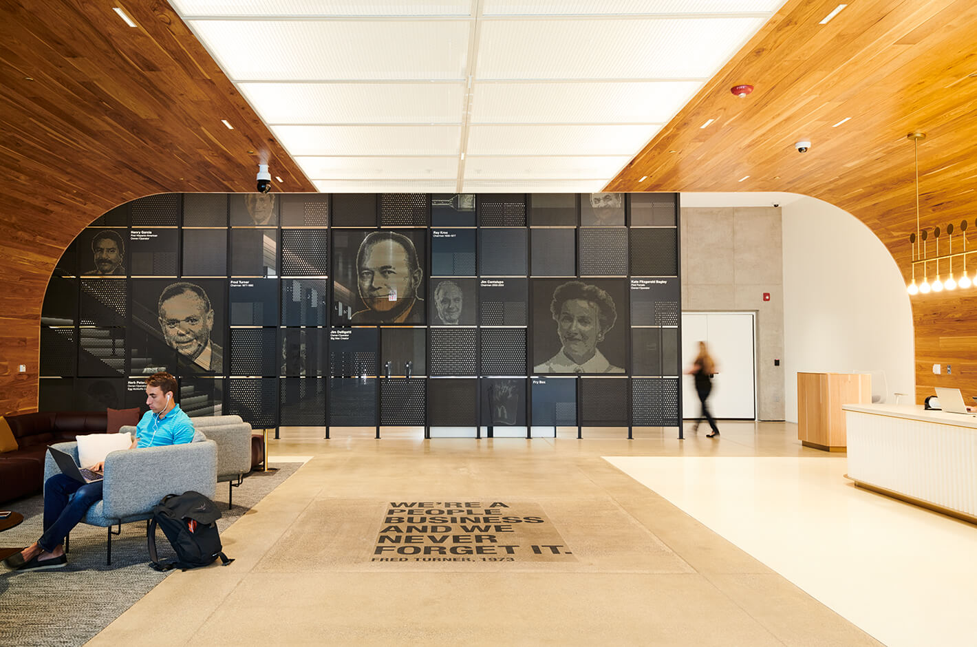
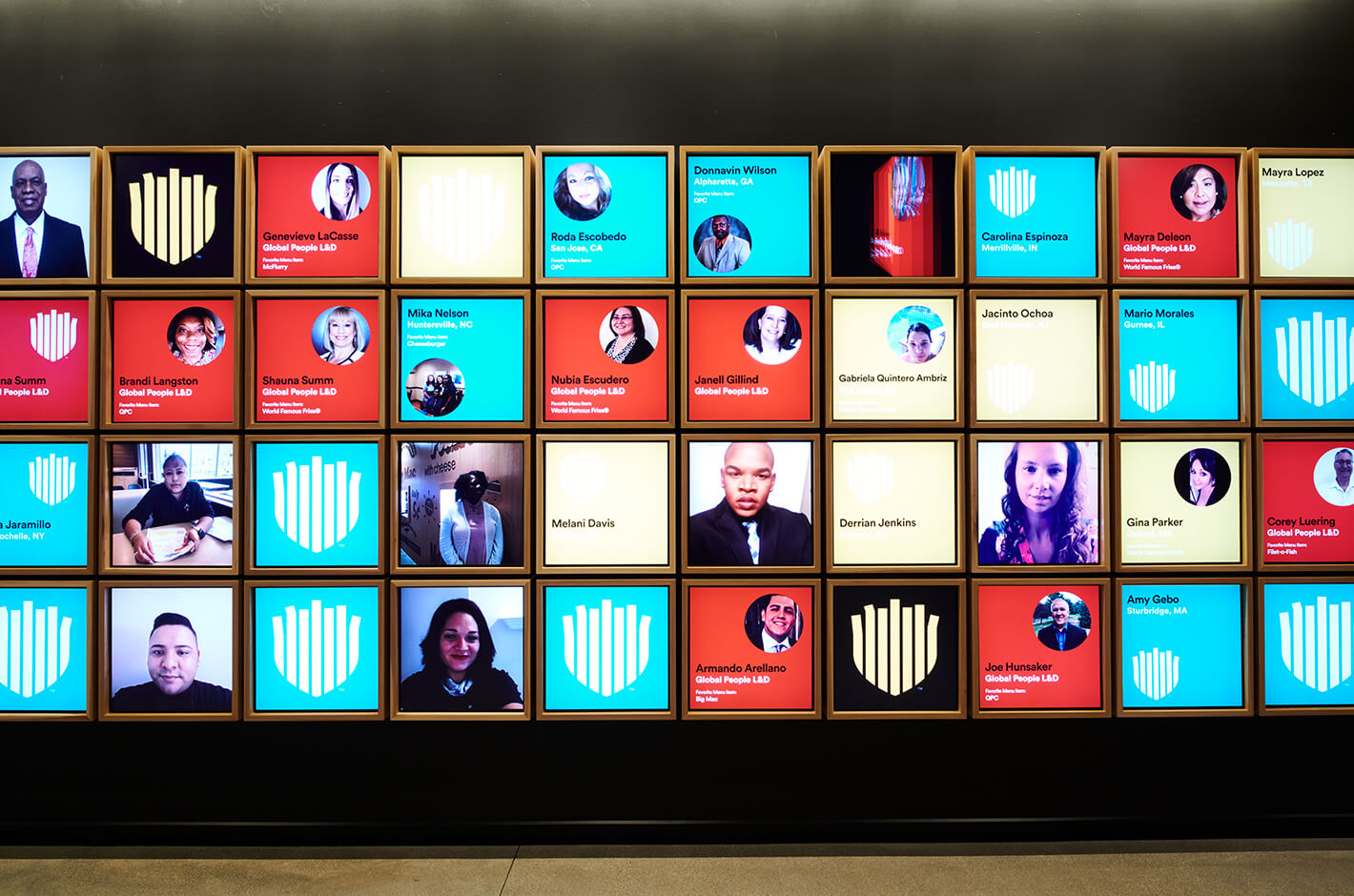
The entrance to Hamburger University is adorned with the faces of individuals important to the making of McDonald’s. The artwork is rearranged about once a year.
-
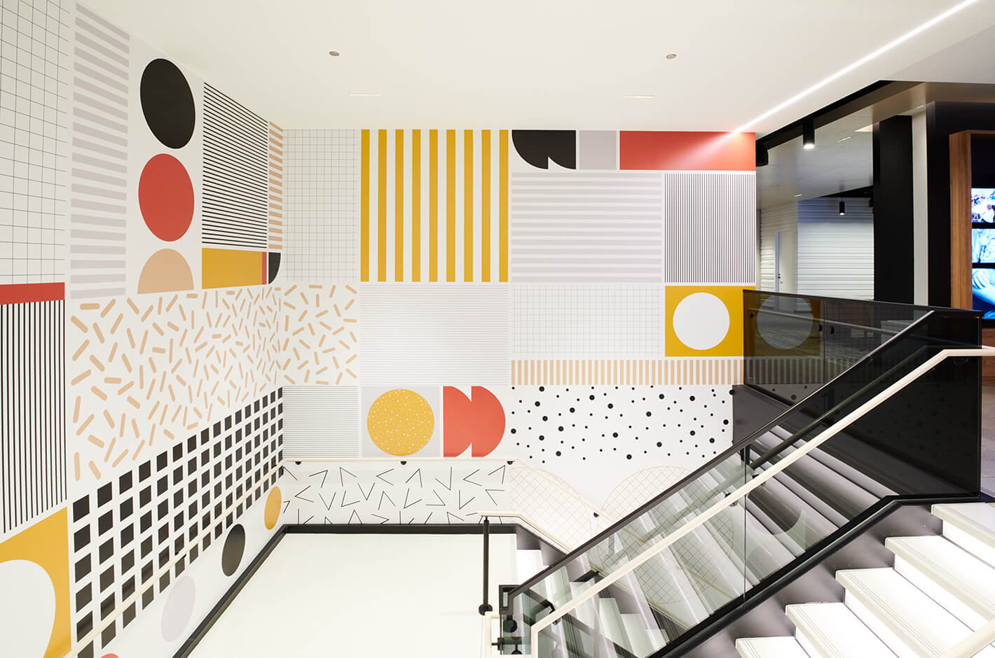
A staircase embellished with O+A-designed wallpaper featuring abstract illustrations of McDonald’s buns, toppings, and beef patties.
-
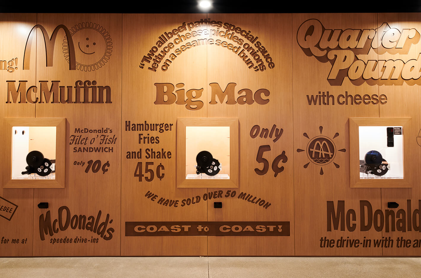
An exhibition space next to the hallway is lined with ingredients, people, toys, tools, and packages that are iconic to McDonald’s.
-
An exhibition space next to the hallway is lined with ingredients, people, toys, tools, and packages that are iconic to McDonald’s.
-
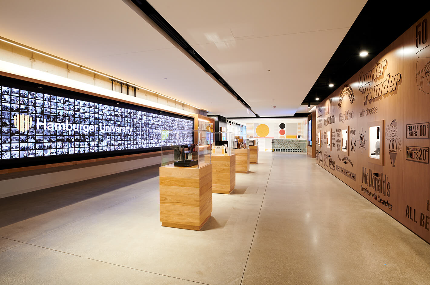
An exhibition space next to the hallway is lined with ingredients, people, toys, tools, and packages that are iconic to McDonald’s.
Consultancy for Work Style: N/A
Architect: Gensler
Interior Design: IA, Studio O+A
photo: Satoshi Minakawa
From WORKSIGHT SPECIAL EDITION【Studio O+A】(2019.7)